

Introduction
The AI world in 2026 moves fast. Really fast.
New models launch every week. Research papers pile up faster than anyone can read them. And decision makers struggle to separate real breakthroughs from noise.
Here’s the problem. Raw data and long reports take too long to digest. By the time you finish reading one analysis, three new developments have already happened.
That is where an ai infographic becomes your secret weapon. A well designed visual summary cuts through the clutter. It turns complex datasets into clear pictures your brain can process in seconds.

Instead of wading through pages of text, you see the pattern immediately.
AI infographics do more than just look good. They bridge the gap between massive amounts of information and the actionable insights you need to make smart moves. Whether you are an investor scanning the landscape or a founder tracking competitors, a strong visual saves you time and sharpens your thinking.
This guide gives you a proven framework for creating high impact AI infographics. You will learn how to use an infographic maker ai tool to turn messy data into visuals that actually drive decisions. And you will discover why the best teams in machine intelligence rely on visual summaries to stay ahead.
If you want to keep up with the daily shifts in AI without spending hours reading, staying informed through a trusted source makes a big difference. The AI newsletter worth reading delivers clear daily updates that pair perfectly with the visual tools we will cover here. Bookmark it and come back as you build your own infographic workflow.
Let us start with the core challenge that every infographic must solve first.
Why AI Infographics Are Essential for Machine Intelligence Professionals in 2026
Here is a number that might surprise you. The global artificial intelligence market hit $900 billion in 2026. That is up from $757 billion just one year earlier. And the pace of new model releases, research papers, and startup funding announcements has grown just as fast. The AI market size and growth trends show a compound annual growth rate of nearly 19% stretching out to 2035.
What does this mean for you as a machine intelligence professional?
It means your inbox, your feed, and your reading list are flooded every single day. Keeping up is not just hard. It is nearly impossible with text alone.
That is where the ai infographic fills a real gap. A well designed visual summary does three things that plain text cannot do as well.
First, it improves recall. Studies in information design show that people remember visual information far longer than written paragraphs. When you pair a key data point with a chart, icon, or color block, your brain locks it in faster. For investors scanning deal flow or founders tracking competitive moves, that memory advantage matters.
Second, it boosts shareability. Infographics travel. They get forwarded in Slack channels, posted on LinkedIn, and included in pitch decks. A single visual can communicate your insight to a whole team in seconds.

Following best infographic practices for 2026 means every graphic you create becomes a reusable asset that spreads your message without extra effort.
Third, it saves you time. You do not need a design degree anymore. An infographic maker ai tool can turn your raw data into a polished visual in minutes. Instead of spending hours wrestling with layout software, you focus on the insight itself. The tool handles the formatting, color balance, and font choices.
For machine intelligence professionals, the payoff is straightforward. Less time spent reading. More time spent acting. Less noise. More signal.
If you are still unsure where to start, read the next section. It walks you through the exact framework for picking the right data and building an infographic that actually gets used.
Top AI Infographic Tools and Platforms in 2026
The good news is you do not have to hunt across dozens of websites to find the right tool. The market for ai infographic tools has matured fast. In 2026, you have real choices that actually work for machine intelligence professionals.
Let us look at the main players and what they do best.
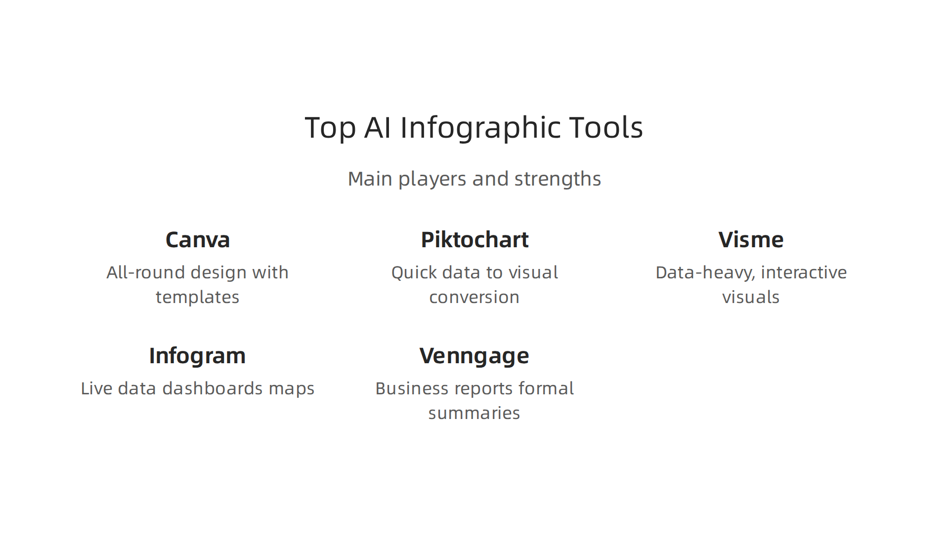
| Tool | Best For | Key AI Features | Starting Price |
|---|---|---|---|
| Canva | All-round design with templates | Magic Studio AI, text to infographic, brand kit | Free; Pro from $12.99/month |
| Piktochart | Quick data to visual conversion | AI infographic maker under 10 seconds, file uploads (PDF, DOCX) | Free; Pro from $14/month |
| Visme | Data-heavy, interactive visuals | Smart charts, animated elements, data import | Free; Starter from $12.25/month |
| Infogram | Live data dashboards and maps | AI chart suggestions, interactive visuals, data linking | Free; Pro from $19/month |
| Venngage | Business reports and formal summaries | AI design generator, accessibility checks, 40+ AI generators on free plan | Free; Premium from $19/month |
Canva is the broadest tool here. Its Magic Studio features let you type a prompt and get a ready infographic in seconds.
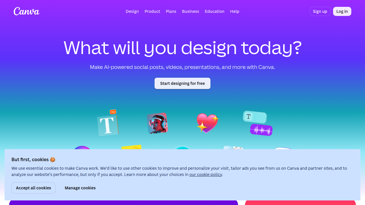
The template library is huge, which saves time when you need something fast. Many teams already use it for other design work, so the learning curve is shallow.
Piktochart shines when you already have written content. You can paste notes or upload a document, and the AI pulls out the key points and lays them out for you.
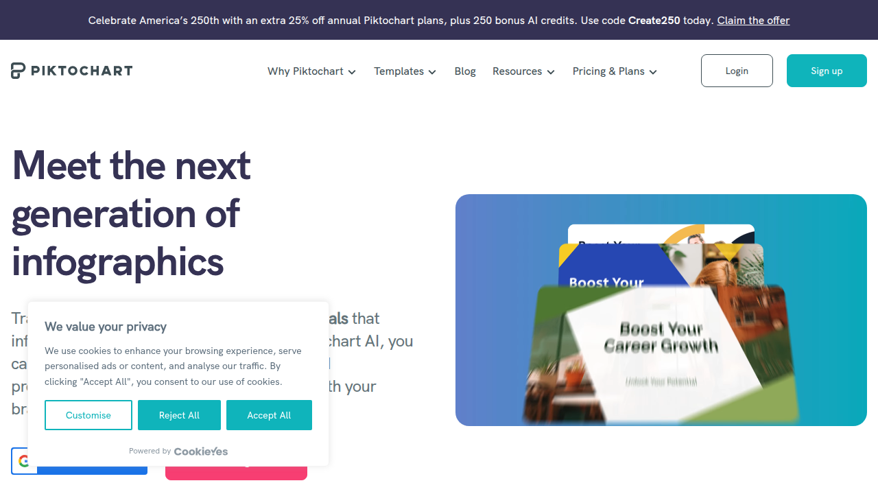
The free AI infographic generator from Piktochart gives you 60 monthly AI credits, which is enough to test it before committing.
Visme is a strong pick when your infographic has lots of numbers. Its charting tools let you import data and get polished visuals without manual formatting. The animated elements also help if you plan to share the graphic in a presentation or on social media.
Infogram is built for data heavy work. If you need your infographic to connect to a live dataset and update automatically, this is your tool. It also offers interactive maps and charts, which works well for research or investor reports.
Venngage leans into formal communication. Its AI generator produces professional looking infographics from a simple prompt. The built in accessibility checker is a bonus if your team needs to meet WCAG standards.
How do you pick the right one? Think about your bottleneck. If you have finished content and just need it designed, Canva or Piktochart are solid. If your starting point is a raw PDF or research notes, a source grounded tool like Piktochart or Venngage saves you the thinking out loud step. And if your infographic must connect to live data, Infogram or Visme are the better fit.
To stay updated on which tools top professionals trust, consider subscribing to The AI Newsletter Worth Reading for daily curated insights.
Best Practices for Creating Data-Driven AI Infographics
You have the tools. But a great ai infographic does not start with a template. It starts with good data and smart design. For machine intelligence professionals, your audience is often executives, investors, or fellow researchers. They do not have time to decode a messy chart. They need the insight fast.
Here are the key rules to follow.
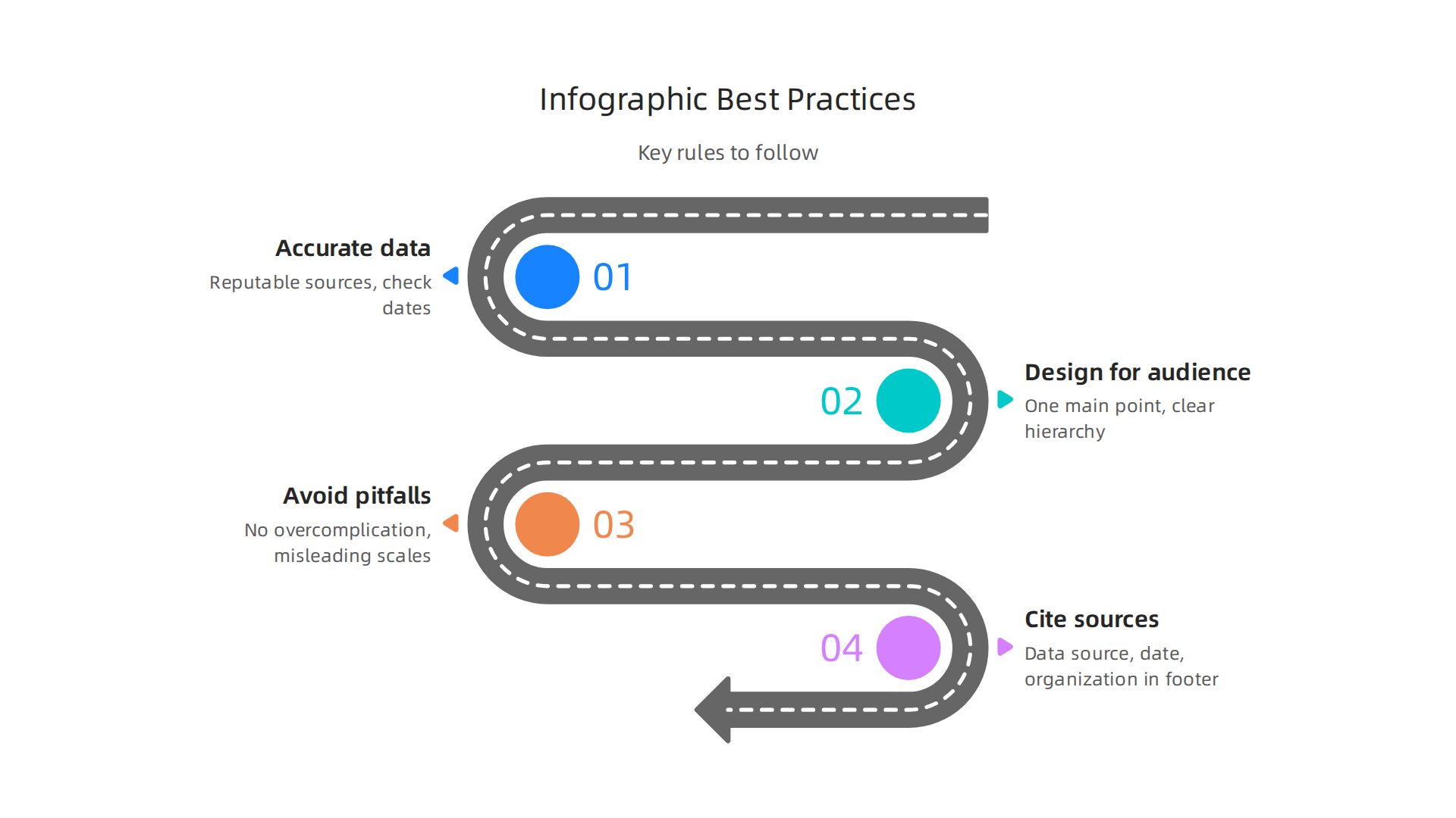
Use accurate and timely data. Nothing kills trust faster than a wrong number or an old statistic. Pull your data from reputable sources like market reports, official datasets, or peer-reviewed studies. Always check the publication date. A 2024 figure is not useful for a 2026 strategy board. If you are comparing model performance, use the latest benchmark results. If you are showing market size, cite a 2026 report. This is where a tool like Piktochart or Venngage helps, because you can upload your source document and let the AI pull the key numbers.
Design for a busy executive audience. Your reader might glance at your graphic for five seconds. Make every element count. Stick to one main point per infographic. If you try to show everything, you end up showing nothing. Use a clear visual hierarchy: a bold headline, one or two hero statistics, a simple chart, and a short conclusion. Limit your color palette to two or three colors that match your brand. Choose one or two fonts max. Keep copy tight. Short headlines. Active verbs. No long paragraphs. The best infographic design patterns from 2026 favor clean backgrounds, lots of white space, and small text that supports the big numbers.
Avoid common pitfalls that ruin credibility. The biggest mistake is overcomplication. Do not add decorative 3D effects or extra icons just because they look cool. They distract. Another trap is misleading scales. If you cut off a bar chart axis, you can make a small difference look huge. That is unethical and will hurt your reputation with smart audiences. Always start your axis at zero unless you have a clear reason not to. Also watch out for AI-generated inaccuracies. Your infographic maker AI might hallucinate a statistic or mislabel a chart. Always verify the output against your source data before sharing. A chart audit can help you catch these issues.
Always cite your sources. Put the data source, publication date, and your organization name in the footer. This is not optional. Unsourced data looks like opinion, not evidence. When your infographic includes a reference to a well-known model or company, it adds weight to your message. If you want to go deeper on evaluating the accuracy of the data behind your visuals, check out our guide on evaluating AI tools with the COVERS benchmark. It gives you a structured way to check trustworthiness.
Bad infographics get ignored. Good ones get shared, bookmarked, and quoted in meetings. Follow these best practices and your ai infographic will do its job.
Step-by-Step Workflow: From Raw Data to Publishable AI Infographic
Now that you understand the best practices, let’s walk through the actual workflow. Here is a simple three-stage process to turn raw data into a polished ai infographic that earns trust.
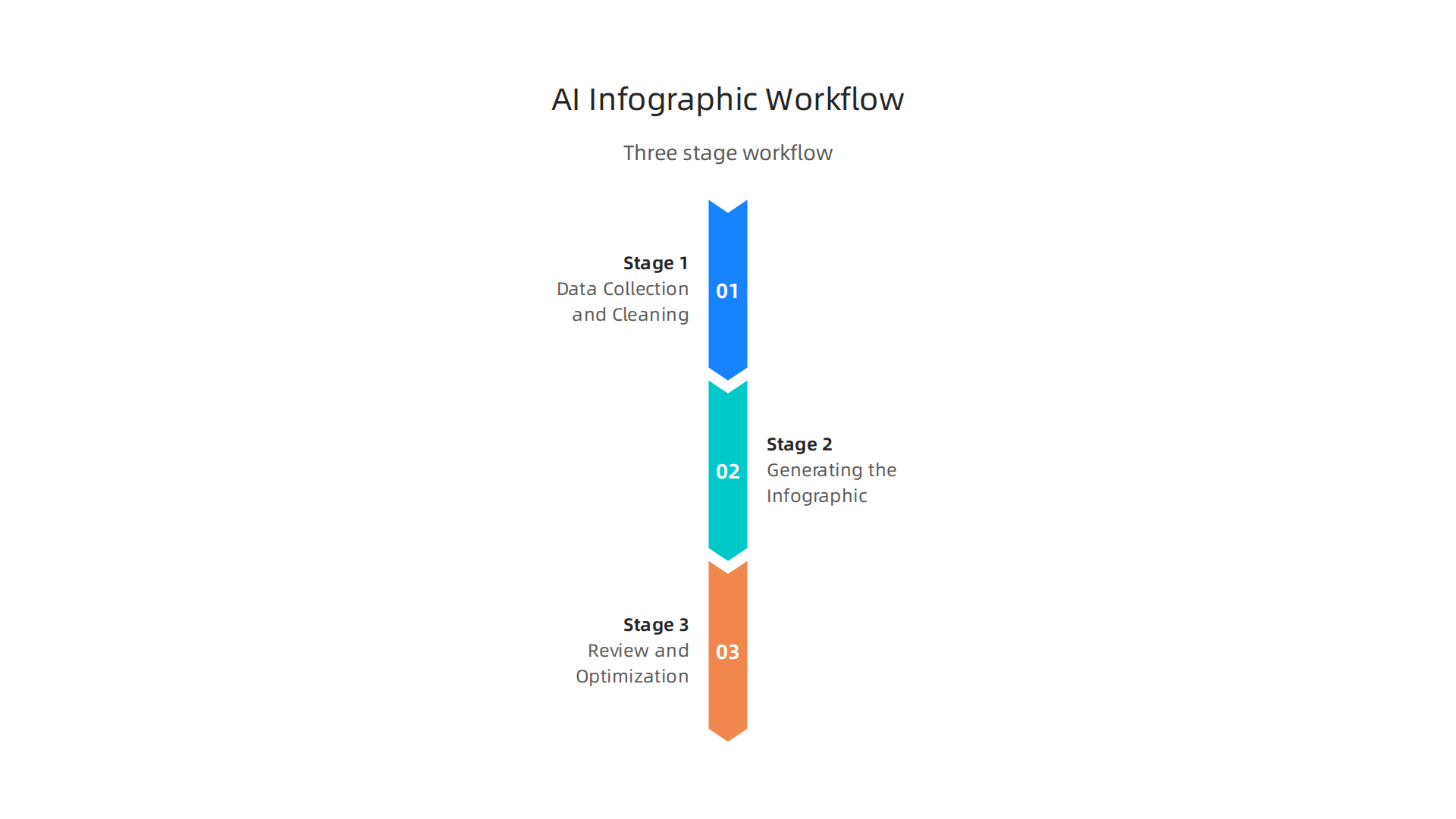
Stage 1: Data Collection and Cleaning
Every strong infographic starts with reliable data. Use AI-assisted data extraction tools to pull numbers and facts from reports, PDFs, or spreadsheets. For example, you can upload a document to a tool like the Piktochart AI infographic generator, which reads your source material and pulls out the key points. This saves you hours of manual copying and pasting.
Once the data is extracted, clean it. Check for duplicates, missing values, or outdated figures. A 2026 statistic should not be mixed with a 2024 baseline without a clear note. AI tools can help flag inconsistencies, but you still need to verify the most important numbers yourself. Good data in means good visuals out.
Stage 2: Generating the Infographic with AI
With clean data ready, open your infographic maker AI of choice. You have many options in 2026. The top AI infographic creator tools for 2026 include Canva, Venngage, Piktochart, and Visme. Most let you start with a simple prompt or by pasting your data.
Select a template that matches your message. Business reports work well with clean, minimal templates. Data-heavy stories benefit from templates with built-in charts and graphs. Let the AI generate a first draft, then customize it. Adjust colors to match your brand. Rewrite headlines to be punchy. Swap out generic icons for ones that make your point clearer. If you are looking for broader inspiration across AI design, you can explore the best creative AI tools for 2026 as well.
Stage 3: Review and Optimization
The AI did its part. Now it is your turn to catch mistakes. Check every number against your source data. Look for labels that got scrambled or chart axes that start at the wrong value. Make sure your brand colors and fonts are applied consistently.
Also test how your infographic looks on a phone screen. Many viewers will open it on mobile. If text is too small or charts are cut off, simplify the layout. Some tools, like the Venngage AI infographic generator demonstration, include built-in accessibility checks that catch contrast issues and readability problems.
Run those checks before you export.
Once everything passes, export your infographic in high resolution—PNG for sharing, PDF for printing. Share it with confidence, knowing your ai infographic is accurate, on-brand, and readable anywhere.
If you want to stay ahead of AI trends and get daily insights in under five minutes, subscribe to The AI Newsletter Worth Reading.

It delivers clear, curated updates straight to your inbox.
Measuring the Impact of Your AI Infographics
You put in the work to create a clean, accurate ai infographic. Now how do you know if it actually works? The answer is tracking. Without measuring, you are just guessing.
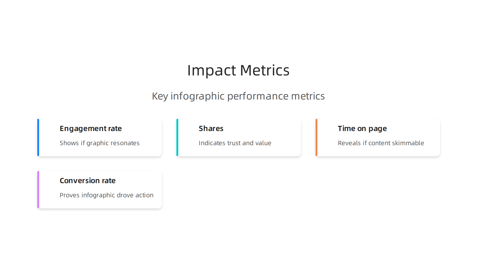
Start with the basics. The most common metrics for infographics are engagement rate, shares, time on page, and conversion rate. Engagement rate tells you how many people interacted with your post. Shares show whether your content was valuable enough to pass along. Time on page reveals if people actually read your infographic or just scrolled past. And conversion rate matters if you gate your infographic behind a form — how many people filled it out?
You can track all these numbers with free tools. Google Analytics measures time on page and conversions. Social media platforms like LinkedIn, Instagram, and Twitter give you built-in insights for engagement and shares. If you want deeper data, you can use a platform like the one described in this 15 essential digital marketing KPIs guide, which breaks down what each metric means and how to improve it.
Here is a quick look at the key metrics and what they tell you:
| Metric | What It Measures | Why It Matters |
|---|---|---|
| Engagement rate | Likes, comments, saves, clicks | Shows if your ai infographic resonates |
| Shares | Times people repost your graphic | Indicates trust and value |
| Time on page | Seconds spent viewing the infographic | Reveals if the content is skimmable |
| Conversion rate | Form fills or downloads | Proves the infographic drove action |
A/B testing is where things get interesting. Try two versions of the same ai infographic with different headlines, color schemes, or layouts. Share them to similar audiences and see which one performs better. AI tools can help you run these tests quickly by generating multiple variations. For example, you can test a vertical layout against a horizontal one, or a busy design against a minimal one. Let the data decide.
If you want to go deeper into understanding how AI tools compare, check out this guide on how to evaluate AI tools using the COVERS AI benchmark. It gives you a framework for judging tools by reliability, cost, and output quality — useful when picking an infographic maker AI that fits your workflow.
The bottom line: do not publish and walk away. Measure what happens after. Use that data to make your next ai infographic even better.

Future Trends: AI Infographics and Generative Visuals in 2026 and Beyond
The tools you just learned to measure are evolving fast. In 2026, AI infographics are doing things that felt impossible just a few years ago. Here are the three biggest shifts to watch.
Real-time data infographics. Picture an infographic that refreshes itself every time new data arrives. No more manual updates or broken charts. AI tools now connect directly to live market feeds, social media streams, and internal dashboards. Your chart updates automatically when numbers change. This is huge for business reports, live presentations, and investor materials. Instead of a static snapshot, you get a living visual that always tells the latest story. Experts across industries predict this kind of dynamic data will become standard, as detailed in this look at trends that will shape AI and tech in 2026.
Personalized infographics. One infographic no longer fits every viewer. AI now tailors visuals to each person’s role and interests. Your CEO sees a version focused on revenue growth. Your product team sees one highlighting feature adoption. Your customers see the data most relevant to them. The same source data produces multiple targeted stories without extra design work. This level of personalization is already showing up in enterprise reporting tools. It saves time and makes each viewer feel like the graphic was built just for them.
AR and VR integration. The next frontier for data visuals is immersive. Instead of a flat chart on a screen, imagine walking inside your data.

Augmented reality lets you project a 3D infographic onto your desk and interact with it. Virtual reality allows you to explore a complex dataset by moving through it. Early tools are already experimenting with these formats, especially in training, research, and analytics. For dense information, immersive visuals can reveal patterns that flat images simply hide.
These changes connect to bigger movements across machine intelligence. For a deeper look at what is driving this shift, this guide to AI trends in 2026 separates real developments from the noise.
Staying ahead of these trends matters more every month. If you want clear, daily updates on where AI is heading, The AI Newsletter Worth Reading delivers insights straight to your inbox.
Summary
This guide shows how to create high-impact AI infographics that turn complex machine‑intelligence data into clear, actionable visuals. It covers why visual summaries outperform long reports for executives and investors, compares top AI infographic tools in 2026, and lays out practical best practices for data accuracy, design, and ethical presentation. You get a three-stage workflow—collect and clean data, generate a draft with an infographic maker AI, and review/optimize for mobile and accessibility—plus a checklist for avoiding common pitfalls like misleading scales or AI hallucinations. The article also explains which metrics to track (engagement, shares, time on page, conversions), how to run A/B tests, and what future features to expect such as live data feeds, personalized variants, and AR/VR experiences. After reading, you’ll know which tools fit different needs, how to audit AI outputs, and how to measure and iterate so your visuals actually get used and shared.